Raya Health
·
Maternal Health
·
Web & Mobile App Design
Role
Product Designer
Year
2025
Platform
Web & Mobile
Team
1 PM, 1 Developer, 2 Designer
Raya Health needed a patient portal that made finding, booking and working with a doula feel simple and personal.
A patient portal that helps expecting and new mothers find a doula, book sessions and manage their care in one place, on desktop and mobile.
FINAL DESIGNS
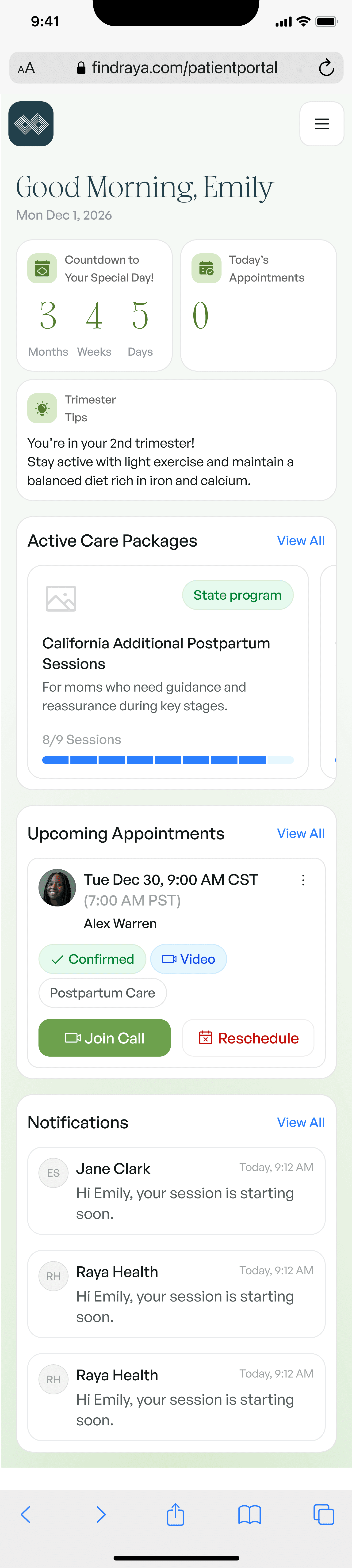
Dashboard: countdown, care package and next session

Matches: doulas that fit each mother’s needs

Intake: a guided questionnaire that powers matching

Appointments: upcoming and pending sessions in one list
CONTEXT
Finding a doula meant calls, forms and long waits
Many mothers qualify for state-funded doula care but don’t know how to access it. Matching happened over email and phone, and once booked, sessions, forms and messages lived in different places.
BRIEF
Design one portal for the whole doula journey
The brief was a responsive patient portal covering sign-up, intake, provider matching, appointments and care packages. It had to work just as well on a phone in a waiting room as on a laptop at home.
PROCESS
We mapped the journey from first visit to final session
I ran interviews with mothers and doulas, mapped the end-to-end journey and prototyped the matching flow first. Weekly reviews with the team kept desktop and mobile in step as the system grew.

The desktop dashboard brings care packages, appointments and notifications together
RESEARCH
Mothers wanted guidance, not a directory
Finding 1
A shortlist beats a directory
Mothers felt overwhelmed browsing every provider and preferred a few strong matches with clear reasons why.
Finding 2
Trust comes from the basics
Experience, services offered and a verified badge mattered more than long bios when choosing a doula.
Finding 3
Mobile is the main device
Most mothers checked appointments and messages on their phones, often between other responsibilities.

Role selection keeps patients and providers on the right path from sign-in
DESIGNING
Each screen answers the question a mother has right now
Three design decisions shaped the mobile portal.
A clear starting point
Before any matches exist, the empty state explains what a doula does and guides mothers straight into finding one, instead of showing a blank list.


Matches with the details that matter
Each match card leads with experience, services and a verified badge, with messaging and booking one tap away. A list view helps mothers compare quickly.
Forms that feel like a conversation
The intake is split into short, friendly sections with progress saved along the way, so mothers can finish it in moments between other tasks.